Dorothy Delong Photography
Project Objective
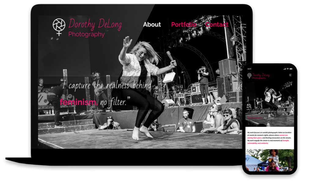
Create a portfolio website for Dorothy DeLong Photography, a company owned by a feminist photographer who wanted a simple website to show some of her most recent work and allow galleries and magazines to contact her with requests.
The Problem
Dorothy has been sharing her work on Facebook. However, she is receiving more inquiries, so she needs a portfolio website so galleries and magazines can view her work and easily contact her.
The Solution
Create a simple, engaging, one-page portfolio website for Dorothy that entices magazines to purchase her photos for publication and helps her work be shown in museums, both locally and abroad.
Design, Planning, & Research
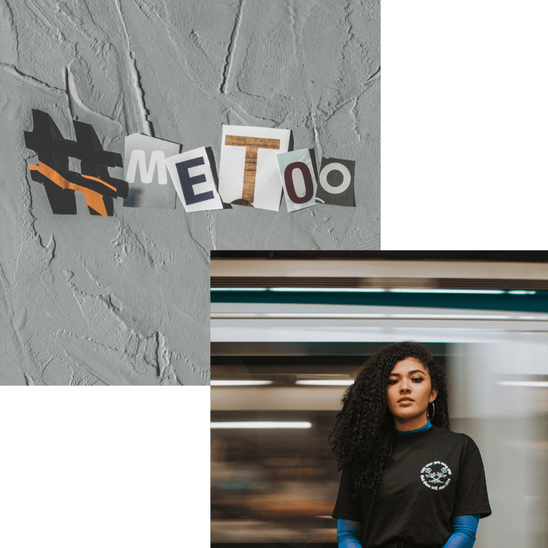
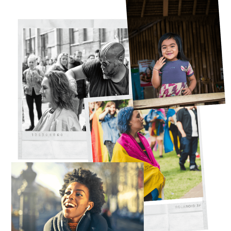
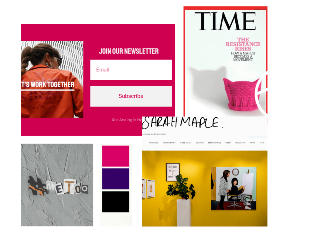
Dorothy’s site had specific parameters, including an artist’s statement, a headshot of her, a quote about her mission, at least four samples of her photography work, contact information, and social media links. I did some research on some photographers in Dorothy’s niche, websites that inspire her, and 20th- and 21st-century feminist movements. I looked for ways to differentiate Dorothy and help her work stand out.
Dorothy’s photos are understated and often feature candid shots in black-and-white, while her color photographs are vibrant and youthful. I wanted to combine these two aspects of her work into the overall theme of her site to keep the focus on her photography.
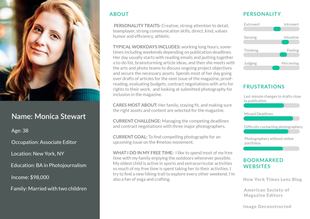
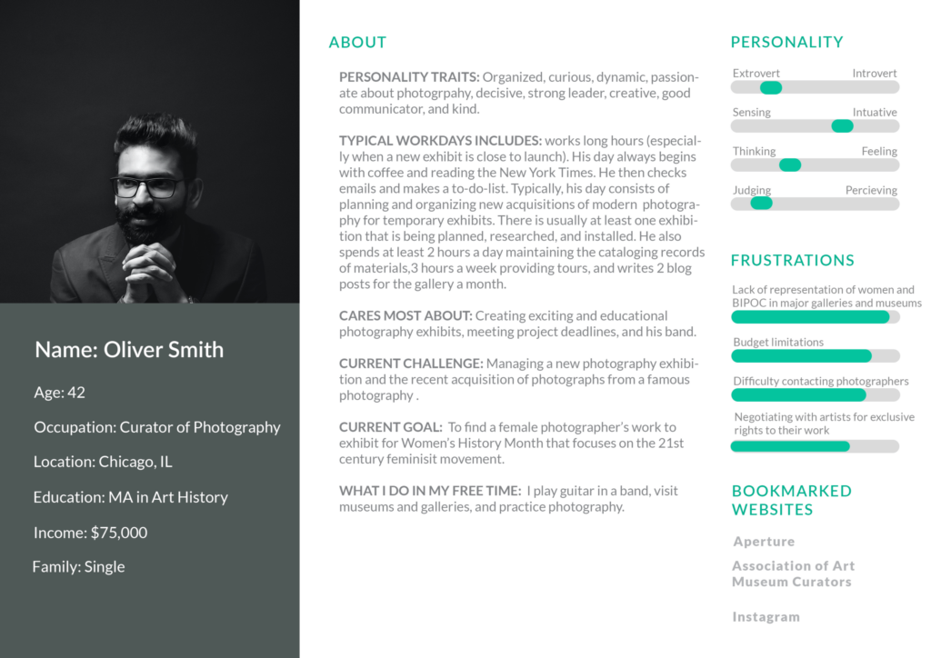
Personas
Mood Board
Colors
Dorothy’s photos are understated and often feature candid shots in black-in-white, while her color photographs are vibrant and have a sense of youthfulness. They are all focused on female experiences or the female viewpoint. I selected a simple palette one bright color, Deep Magenta, that evokes energy, youthfulness, and feminism to highlight Dorothy’s work and engage her audience. I rounded out the color palette with Deep Purple and Black.


Typography
I wanted Dorothy’s typography to convey a sense of youthfulness and approachability. It needed to be vibrant and understandable to mimic the tone set with her photographs. I selected Bad Script and Raleway to achieve these goals.
Dorothy Delong
Bad Script
Photography
Raleway
Software
I utilized Adobe XD to create low-fidelity and hi-fidelity mockups, as well as final mobile, desktop, and mobile design comps. I also utilized Adobe Photoshop and Illustrator to manage assets.
