Bean Pub
Project Objective
Develop a brand and identity for a new local coffee shop, Bean Pub, that will open soon. The owner wants a brand that fits her products and values and resonates with the neighborhood.
The Problem
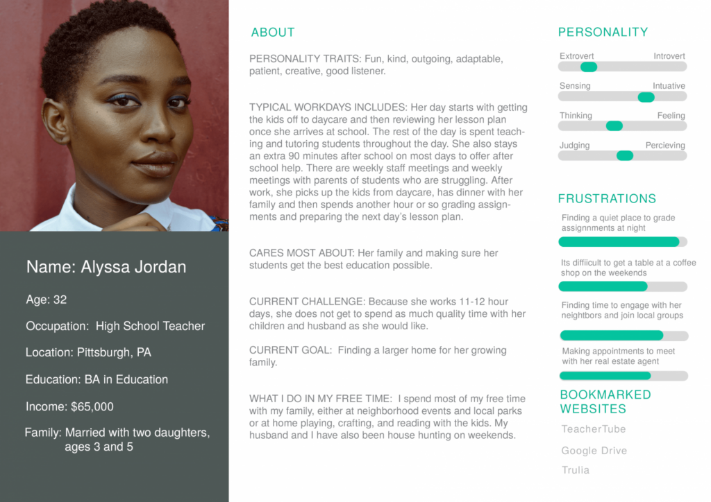
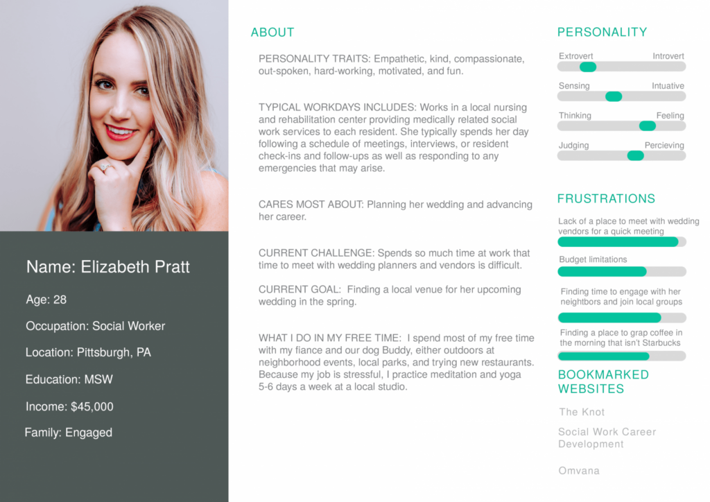
Karla Kahv, an aspiring local coffee shop owner, has funding and a great location in her hometown neighborhood, a progressive enclave of young professionals, families, and students. Karla’s strength lies in managing her shop’s business and financial side, but she needs to develop her brand. She wants to have a soft launch in a month.
The Solution
Create an identity design for Karla’s business that highlights her products, engages the community, and reflects her values. Deliverables include a color scheme, type scale, collection of brand images, logo, icon pair, social media header, and a brand style guide.
Design, Planning, & Research
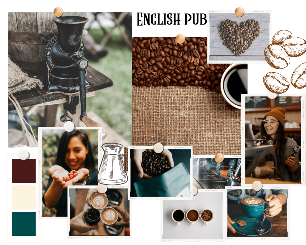
Karla, inspired by the community-centric nature of English pubs, envisioned her coffee shop as a place where everyone feels a sense of belonging. This led me to delve into the significance of pubs in their local communities. They are not just bars, but community hubs where people of all ages, from families to friends, come together.
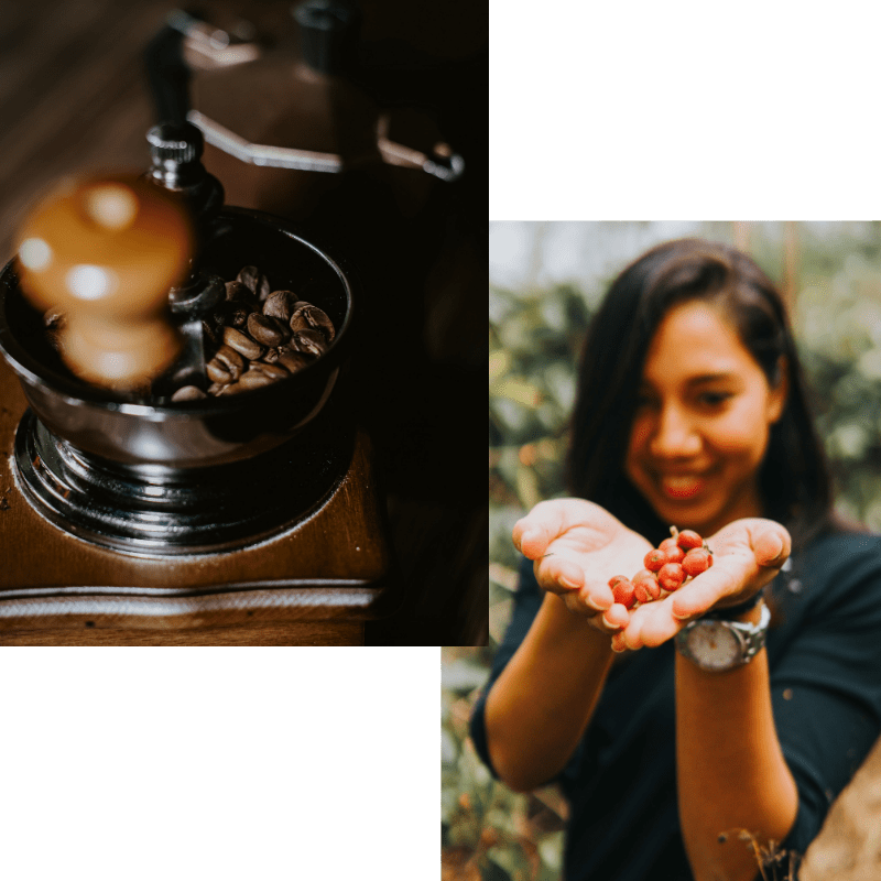
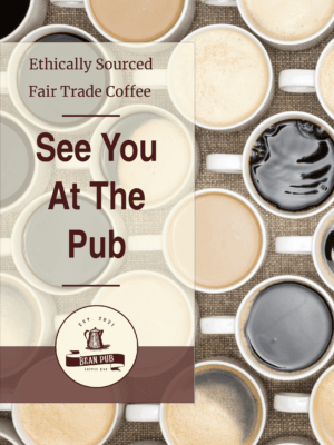
Karla’s commitment to ethically sourced coffee products and traditional brewing methods is a testament to her dedication to quality and sustainability. This is a coffee shop where every cup is a conscious choice, a choice that makes a difference.
Guided by pubs’ essence, aesthetics, and Karla’s local community, we crafted a brand personality that exudes sincerity, warmth, and a welcoming spirit. The chosen color scheme and vintage fonts further enhance this, creating a modern yet nostalgic atmosphere that invites you in.
Personas
Mood Board
Colors
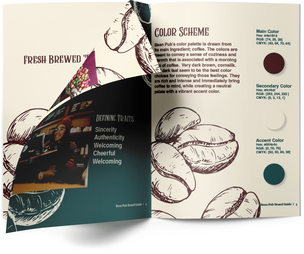
Bean Pub’s color palette draws from its main ingredient: coffee. The colors convey a sense of coziness and warzmth associated with a morning cup of coffee—very dark brown cornsilk and dark teal seem to be the best choices. They are rich and intense and immediately bring coffee to mind while creating a neutral palette with a vibrant accent color.


Typography
I selected these typefaces because they best combine the vintage and modern aesthetic of the brand.
Bean Pub
Rumble Brave
Coffee Bar
Merriweather
Logo
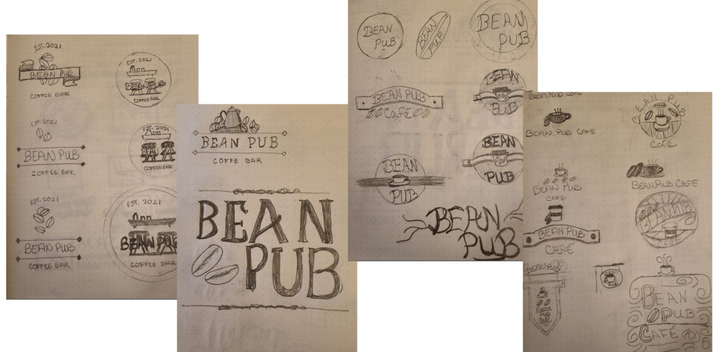
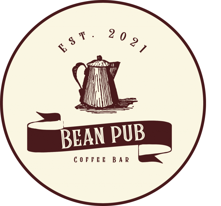
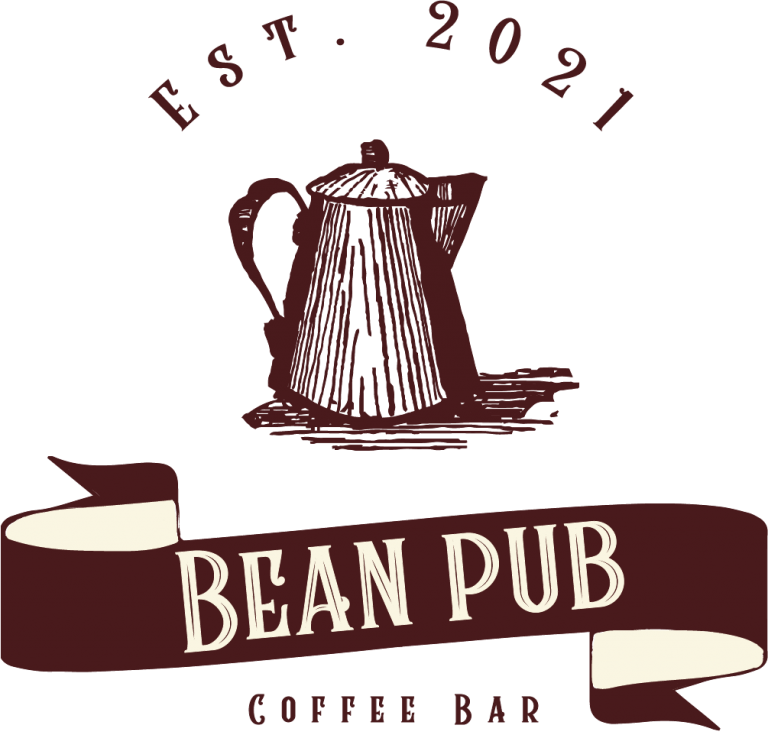
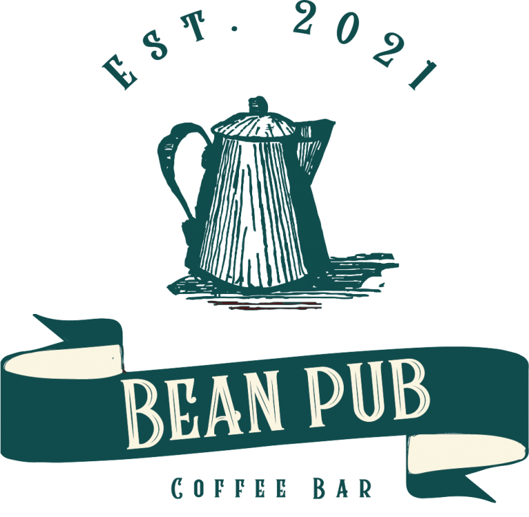
Bean Pub’s primary logo is a wordmark and an icon. The principal lettering has a vintage style, while the icon offers a hand-drawn aesthetic that conveys the down-to-earth and personal values of the brand.
Software
I created the logo and icons using Procreate and Adobe Illustrator. I also used Adobe Photoshop to make social media assets and modify imagery, and Adobe InDesign to develop the final style guide.
